As the saying goes, a picture is worth a thousand words. Yet images on mobile devices can translate to more data used. In many parts of the world, high mobile data costs present a significant barrier to accessing knowledge on the Wikimedia sites.
To address this, the Wikimedia Reading web team has made the article download process on Wikimedia mobile sites more efficient by preventing unnecessary image downloads. We’ve already seen the positive impact of this change on the amount of data used to access Wikimedia mobile content around the world.
(If you’re a developer who is curious about how the change was made, we have a complete rundown in the last section of this post.)
Why we made the change
As of this year, over half of Wikimedia’s traffic comes from mobile devices. Readers access Wikipedia through mobile now more than ever, and we have to continue to understand and build for our readers’ changing needs.
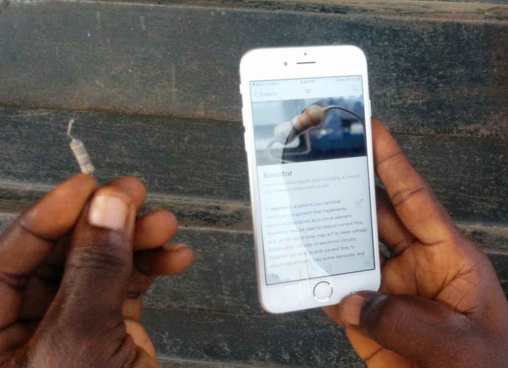
From the Foundation’s work with the New Readers initiative, we know that in places like Nigeria and India, high data costs are considered one of the largest barriers to accessing and reading Wikipedia. Feature phones and lower-grade Android smartphones are the primary devices for connecting to the internet, and in Nigeria, internet access has been prohibitively expensive. Data is a precious commodity in many countries, due to high bandwidth costs, bandwidth caps, and inconsistent internet connections.
For context, the average web page consumes about 2.3MB of a mobile data plan. A web page is composed of several elements including the text you read, the CSS code that styles its interface, JavaScript code that makes the page more interactive, and images that illustrate it. Browsers do a good job of downloading these elements efficiently, but images and text respectively remain the biggest consumers of data.
To illustrate this impact, as of June 2016, the article about Japan on the Japanese Wikipedia contained 1.4MB of images, 195KB of text, 157KB of JavaScript and 8KB of CSS. Without loading any of the images for the article, that would translate to about 0.03USD in mobile data costs (on a post-paid data plan in Japan) rather than 0.15USD with all the images loaded for the article.
Similar stories can be told for people in Brazil reading the Portuguese article about Brasil or people in the United States reading the Barack Obama article in English.
We made this change as our research has indicated that many of our mobile users, despite downloading an entire article, do not read every single word. On the mobile site, many people presumably use Wikipedia as a quick fact lookup. Knowing this, we were concerned about the amount of images people downloaded unnecessarily, and how those downloaded images might then impact their ability to consume knowledge.
Photos are a ubiquitous element of Wikipedia’s most popular and highest quality articles, and this change now means that your phone will only load images as you scroll down a page, rather than on opening a page.
How much more efficient?
We wanted to see how this change impacted readers, so we looked at the traffic to our image servers across three language wikis for a week-long period before and after the change was made. We restricted our analysis to images that had been requested by page views—to avoid requests from external websites that we cannot control—by looking for a HTTP referrer header (a piece of information sent by web browsers to describe the context in which the request was made). We analysed the English Wikipedia because it has the highest volume by traffic, as well as the Japanese and Indonesian Wikipedias because these languages are mostly spoken inside a single geographical area—as we were also interested in the impact on speed, we wanted to rule out factors such as distance from the closest data center that would affect our results.
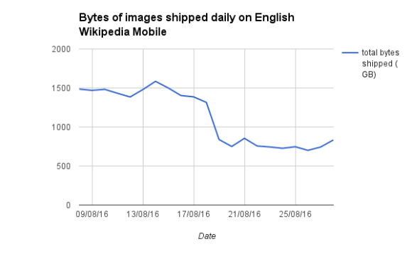
Our analysis showed that on the mobile site of Indonesian Wikipedia, our data centers served our visitors 187 gigabytes less, a 32% decrease compared to a week before the change. For the same period on English Wikipedia, the decrease in data usage was even greater: we shipped 4.9 terabytes less than normal (that’s enough data to fill 1042 DVDs), resulting in a 47% decrease. On the Japanese Wikipedia, the results were similar—we saw a 51% decrease in data usage. Projecting the savings across all of Wikipedia, we hope to annually save our users 450 terabytes of mobile data!

This reduction in data usage means web browsers will load Wikipedia pages in less time, because there’s less to load. Certain users on slower connections may even find their web pages display quicker, as there are now fewer requests battling for bandwidth. We’re now looking into whether these changes are significant, which can be challenging due to the limitations of older browsers, the scale of Wikipedia’s traffic and the limited information we collect about our users in keeping with our strong commitment to user privacy.
To further demonstrate the impact of this change, let’s go back to the example of the Japan article on the Japanese Wikipedia, which weighed 1.76MB, and consider a 500mb data plan. Assuming the user accessed the internet for no other purpose, that article could have been consulted 9 times each day for a month, before the reader incurred additional charges or lost internet connectivity. After our changes on that same data plan, that particular article weighs only 530KB and could be viewed up to 30 times a day!
Next steps
The positive results that we are seeing are just the start. We are currently monitoring our page view traffic to see if this change leads to readers spending more time on our websites. The Wikimedia Foundation is also working on reducing the amount of JavaScript and CSS we serve, as well as thinking about ideas around speeding up their delivery. We are exploring how using new open web technologies such as Service Workers can help get content to our users more quickly. We’re also thinking about offline use cases for those users who, at times, may have no connection at all. Outside mobile, we hope to explore how we might apply similar enhancements for our desktop readers.
Let us know how these changes have impacted you using this wiki page. Do you notice the difference? How has this changed your mobile reading experience? Have you noticed any bugs? What else could we be doing? We’d love to hear your thoughts.
How we did it (technical)
We also wanted to outline exactly how we made this change for technical audiences who might find the information useful. This section details how we prevented images from downloading unnecessarily, and is aimed at a developer audience.
Any image inside a block of HTML will be loaded unconditionally, so the only way to avoid this was to remove our image tags from the HTML output.
Rather than outputting an image into our HTML, we wrapped the image inside a <noscript> tag and appended a placeholder element with all the information needed to render the image via JavaScript. Our users who didn’t have JavaScript enabled would see the image inside the <noscript> tag and not benefit from the optimisation. For those with JavaScript, we had enough information to load the image when necessary.
<noscript>
<img alt=”A young boy (preteen), a younger girl (toddler), a woman (about age thirty) and a man (in his mid-fifties) sit on a lawn wearing contemporary c.-1970 attire. The adults wear sunglasses and the boy wears sandals.” src=”//upload.wikimedia.org/wikipedia/en/thumb/3/33/Ann_Dunham_with_father_and_children.jpg/300px-Ann_Dunham_with_father_and_children.jpg” width=”300″ height=”199″ class=”thumbimage” data-file-width=”320″ data-file-height=”212″>
</noscript>
<span class=”lazy-image-placeholder” style=”width: 300px;height: 199px;” data-src=”//upload.wikimedia.org/wikipedia/en/thumb/3/33/Ann_Dunham_with_father_and_children.jpg/300px-Ann_Dunham_with_father_and_children.jpg” data-alt=”A young boy (preteen), a younger girl (toddler), a woman (about age thirty) and a man (in his mid-fifties) sit on a lawn wearing contemporary c.-1970 attire. The adults wear sunglasses and the boy wears sandals.” data-width=”300″ data-height=”199″ data-class=”thumbimage”></span>
For those with JavaScript enabled, we listened to the window scroll event and for any unloaded images (those with temporary placeholders), which loaded them when they moved close to the viewport. We wanted the experience of loading an image to be seamless so we used a generous offset, to load images before they might be needed. We also checked if the placeholder was visible given that it might be in a collapsed section. In that case images showed when a reader expanded the section.
Many websites use a lower resolution image as a place holder. We decided against this because we felt it would be detrimental to the goal of avoiding unnecessarily sending bytes to our users. Instead we relied on a CSS animation to ease the transition from no image to image.
var offset = $( window ).height() * 1.5;
if ( mw.viewport.isElementCloseToViewport( placeholder, offset ) && $placeholder.is( ‘:visible’ ) ) {
self.loadImage( $placeholder );
}
There was another set of users we had to consider—those with older browsers. To provide a better experience to our users on older browsers, we avoid running JavaScript, even if enabled. For these browsers we injected a small amount of JavaScript that replaced the placeholder with the original image tag, copying across all the necessary attributes. We were careful to use methods that enjoy broad browser support. For example rather than using getElementsByClassName we used the even more widely supported getElementsByTagName, which is supported by virtually all browsers.
var ns,i,p,img;
ns=document.getElementsByTagName(‘noscript’);
for(i=0;i<ns.length;i++){
p=ns[i].nextSibling;
if(p && p.className && p.className.indexOf(‘lazy-image-placeholder’)>-1){
img=document.createElement(‘img’);
img.setAttribute(‘src’,p.getAttribute(‘data-src’));
img.setAttribute(‘width’,p.getAttribute(‘data-width’));
img.setAttribute(‘height’,p.getAttribute(‘data-height’));
img.setAttribute(‘alt’,p.getAttribute(‘data-alt’));
p.parentNode.replaceChild(img,p);
}
}
The biggest challenges we experienced were ensuring the lazy image placeholders we were adding would not disrupt the presentation of the content. For example, images might be inline or block elements. We spent the majority of our time tweaking CSS rules to ensure disruption was minimal as possible. If you happen to find any bugs with our implementation please raise them!
Jon Robson, Senior Software Engineer
Wikimedia Foundation


