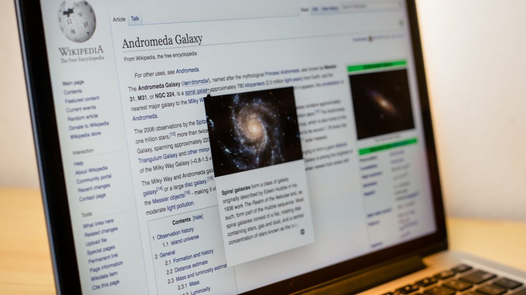
A few weeks ago, we deployed the page previews feature to English Wikipedia. This deployment marked the completion of one of the largest changes we’ve made to the desktop version of Wikipedia in years. Since then, we’ve received a number of questions about our process, motivations, and documentation. Given that much of our work is already online, we thought it’d be nice to share a bit more.
As tech lead Jon Robson wrote in his blog post, page previews took us a pretty long time to complete. This long timeline was in part due to technical complexity as well as to our best attempts at rigour in terms of instrumentation, testing, and having thorough conversations with our communities on what they wanted the feature to be like in the long term. Here’s a list of the documentation we’ve gathered along the way:
General
The main MediaWiki page for the project contains an overview of the project and functionality, links to research and requirements, an overview of the history of the feature, and deployment plans.
Product
Product requirements and detailed descriptions of workflows and functionality: Before we deployed to any wikis, we refactored our code. As this marked somewhat of a fresh start, we made sure to collect all requirements for the feature ahead of time. We incorporated feedback from our communities to include all requested updates.
Initial blog post on launching this as a beta feature: The story of page previews goes far back. The feature was initially presented to logged-in users as a beta feature, then called “hovercards,” back in 2014. Since then, it has changed in appearance and functionality significantly.
Design
How we designed page previews for Wikipedia and what could be done with them in the future: Even though page previews may seem simple at first glance, many complexities lie beneath the surface. This blog post goes into detail on why this is the case, which issues particular to Wikipedia we had to consider in terms of designing the feature, and how these considerations translated into the final design
Design improvements since the first iteration of the feature: This is a list of design updates we made since the initial iteration of page previews in beta.
Engineering
Records of architectural decisions: Here, you can see why we build page previews the way we did, and track the architectural decisions we made along the way.
API Specification: In the beginning, previews were in plaintext. Our communities were rightly interested in presenting page previews in html to allow for rendering content true to its original form. This makes sense – we didn’t want strange bugs and missing formulas to detract from the benefits of page previews. However, we did not want to process all of this HTML within the Page Previews client. The less work the client has to do to display a preview, the better. Thus, we built a new API that could generate summaries for page previews as well as for other similar features in the future.
Code details: For the engineers among you, this page contains details on the code for page previews and instructions on how to set the feature up for other wikis.
“Beacons”: This blog post highlights the process of identifying and replicating one of the most confusing bugs we’ve come across so far. During our first round of A/B testing, we ran into a very strange bug within our instrumentation. We were seeing duplicate events logged for every link hover and it tooks us a lot of effort to get to the core of the issue — a bug in the Firefox browser. We worked with the Mozilla team to resolve this issue and were able to continue measuring the performance of the feature bug-free.
Page previews front-end tooling: This series of blog posts explains the different technical decisions and choices in technology and tooling for the front-end part of the extension. The posts provide reasoning, explanations, pros and cons, and our conclusions.
mustache.js replaced with JavaScript template literals in Extension:Popups: The Popups MediaWiki extension previously used HTML UI templates inflated by the mustache.js template system. This post provides the reasoning behind replacing Mustache with ES6 syntax without changing existing device support or readability.
Data
2017-18 A/B Tests: Page Previews are designed to reduce the cost of exploring a link, as well as to promote learning, by allowing readers to gain context on the article they are reading or to quickly check the definition of an unfamiliar event, idea, object, or term without navigating away from their original topic. To gauge the success of the feature, we wanted to test these assumptions by performing an A/B test on the English and German wikipedias. This page includes details of our methodology, the hypotheses we decided to test, and our results.
Hovercards Usability Research: In addition to quantitative testing, we also wanted to test qualitatively to gain insight into user opinions on page previews. We looked into opinion based questions as well as overall usability – Do people like the feature? Do they know how to turn it on/off? Do they find it annoying? How do they feel about the presence and size of images? Etc, etc.
2016 A/B Test Results: Our first A/B test, while providing us valuable insight into the feature was most valuable as a means of improving before a larger scale test. Here, we gauged the performance of the feature on Hungarian, Italian, and Russian Wikipedias. During the process of collecting and analysing our data we also ran into a number of bugs and issues within our instrumentation that allowed us to refine and improve, making sure all subsequent tests were issue-free.
Greek and Catalan usability test: Back in 2015, we performed the first investigation into the performance of the feature. We ran a survey on beta users on Greek and Catalan Wikipedias. A number of issues and bugs were reported and user satisfaction was recorded using a survey. Users had generally favorable feedback, with the majority of users finding hovercards useful, easy to use, and enjoyable to use.
Olga Vasileva, Product Manager, Reading Product
Wikimedia Foundation


